Last night saw the final open forum session at the Mersey Observatory Design Competition exhibitions - this time at the Seacombe Ferry Terminal exhibition. Here are a selection of the opinions expressed on the night:
From Maria Checkland
Favourite is Ellis Williams traditional design with modern twist. Wouldn’t be out of place is “Megastructures” Looks like a world class observatory. Links to transport, good access and well thought out.
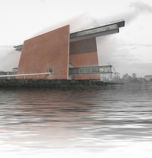
Least favourite is Farrell and Clark – looks like a car park or power station.
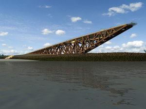
Studio 8 is a nice design but not unique – similar to Marine Way Bridge in Southport.
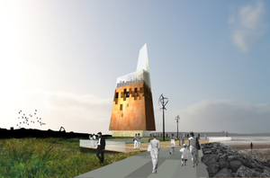
Phos – a variation on the tall phallic buildings we are being subjected to by architects.
Duggan Morris – Conceptual design but I feel this would date. In 20 years time this may be the kind of embarrassment the “sandcastle” in Liverpool is.
From Cllr Chris Blakeley
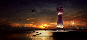
First choice = Duggan Morris whist initially looking like a jug, it appears to be the most pleasing to the eye.
Second choice = Ellis Williams.
The other three have no appeal to me at all.
The most important view should be from those people who have to live with the view [of the structure] all the time.
From Shulah Jones
After much pondering I definitely think the Duggan Morris proposal is particularly striking and yet not over imposing. I like the way it appears to rise out of the water as a beacon. It looks very striking illuminated in the diagram. Would really act as an imposing gateway to the River Mersey.
From Ian Pettman
Duggan Morris is a quite an acceptable design.
Farrell and Clarke, Phos and Ellis Williams I feel would be eyesores.
Studio 8 is interesting but doesn’t look very practical.
Comments from anonymous contributor #1
Studio 8 – interesting shape but feel that it blends too much [into the landscape] and won’t be seen from across the river.
Duggan Morris – most favourite design. Visually exciting, good facilities, stands out in the landscape without detracting, lots of viewing opportunities, innovative structure to be seen ay and night.
Farrell and Clarke – least favourite design. Too severe in the landscape. Appears to close in the space rather than open it up.
Phos – A bold statement but perhaps not sympathetic enough with the landscape. Seems to limit views rather than open them out.
Ellis Williams – like the concept of recreating piers but this design seems too heavy and visually blends in too much.
Comments from anonymous contributor #2
Phos – did the architects only have a set square to design this with?
Studio 8 – is this physically stable in high wind.
Ellis Williams – perhaps too large or industrial looking for this site.
Farrell and Clarke – no.
Duggan and Morris – finally a proper observatory.
Comments from anonymous contributor #3
Studio 8 - Are they subliminally appealing for our approval by building a giant tick? The shape of it is very elegant but the size is way too big! I’m not even sure how visitors are supposed to use it. I think the best views would be from a platform that’s too exposed to be used for most of the year.
Duggan Morris – Elegant, iconic and individualistic. Of the shortlist this is my favourite – the only one I would travel to see. My only concern is whether it is achievable and affordable (remember Will Alsop’s “Cloud”?). This would also add an unmistakeable recognisable “Welcome to Merseyside” for liner passengers.
Farrell and Clarke – This is just ugly. Merseyside has acquired more than enough brutalist slabs in recent years – please don’t build this. The worst of the shortlist. The view from the sea is reminiscent of dockyard cranes – functional and ugly. Liner passengers wouldn’t give it a second glance.
Phos – This looks like an odd collection of mismatched ideas. How does a glazed garden sit on top of a rusty box? It manages to combine an odd shape with a complete lack of character. Weathered steel speaks of rust and industrial decline – welcome to Merseyside in the seventies!
Ellis Williams – I’ve seen this before – it’s a sculpture on a roundabout in Speke. It may be the most practical of the shortlist – certainly the most accessible – but its appearance is bland and forgettable. It is not an iconic gateway structure. The views may be spectacular and accessible but the structure itself is not special enough to make people want to go there.
Have you seen the designs? What do you think? Which is your favourite? Leave a comment below.......


Recent Comments