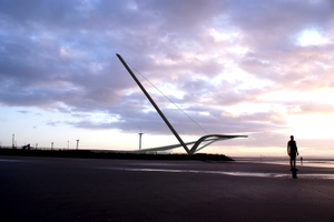
The new Mersey Observatory will offer the chance to see for yourself unrivalled panoramic views of the Mersey, the docks and shipping on the river, surrounding beaches and wildlife, and the city of Liverpool. But what will the building itself look like? Here's a taster of the five shortlisted designs - for more information you'll need to visit the public exhibitions (see below for details):
Duggan Morris Architects
Ellis Williams Architects
Farrel and Clark Architects
Phos Architects
Studio 8 Architects
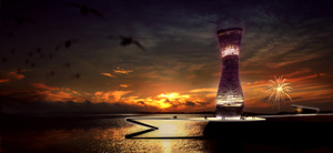
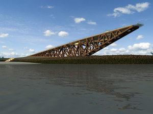
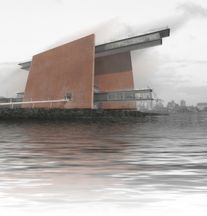
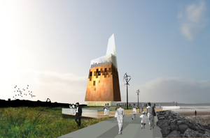
they look great
i found this on one of them,
http://www.vimeo.com/688009
Posted by: Sarah | Monday, February 18, 2008 at 03:04 PM
Excellent, thanks for pointing us to that, Sarah. If you're in the area, pop down to one of the exhibitions and let us know what you think of all 5 designs. Thanks again,
Kate
Posted by: Kate | Monday, February 18, 2008 at 03:35 PM
i went to the exhibition last night at crosby and it was really impressive. My fav has got to be the pier one, i thought it was amazing that you could walk up a ramp and end up on a glass tip above the sea? I didnt like the one that looked like a car park at all, also the vase and bowl building wasnt that good. my second fav was the one which looked like a tick, but it missed out by having no enclosed space at the end like the other, also i wasnt to keen on all the steps. I hope lots of people from our local area come along and have a look, as a local (bootle).
Posted by: Sarah | Tuesday, February 19, 2008 at 08:25 AM
Thanks for your thoughts Sarah - hoepfully more people will also come along and leave us their comments. I'm attending the session at the RENEW Rooms in Liverpool tomorrow to blog about what people think of the designs there, so watch this space........
Posted by: Kate | Tuesday, February 19, 2008 at 02:20 PM
Of the shortlisted five, Ellis Williams' proposal is architecturally the most professional and elegant, though a lighter colour might do good for the overall appearance. Also the funcionality seems good based on the video at http://www.vimeo.com/688009. The rest have issues with arcitectural quality or structure (Studio 8), in my opinion.
The proposal we did:
http://jumartti.pp.fi/arkkitehtuuri/Mersey%20Observatory/The%20Mersey%20Observatory.htm
Posted by: Jan | Wednesday, February 20, 2008 at 08:56 AM
Thanks for your thoughts, Jan. We're working on a web archive to showcase all the entries - it should go live in late March at www.merseyobservatory.com. Keep the comments coming!
Posted by: Kate | Wednesday, February 20, 2008 at 09:09 AM
After visiting the exhibition yesterday i came away with some mixed feelings and concerns, overall i agree with Jan's comments about Ellis Williams design being the most professional design, as this one looks like it actually can be build and enhance the area. I had concerns about the other designs, eg would the studio 8 structure actually stand up? and if it did is it actually worth while as the observation deck is now exposed to the elements and on how many days could this be used? Other concerns relationg to the other designs include, the farrel & clark design is to oppresive and wold not be a nice sight entering from the mersey and also on the beach. Duggen morris's design is to complicated, and why is it based on a bowl and vase? how is this relating to the site, city and context, the "objects" place with no relation to anything and would be lost. Phos is a better option to the precious one, but is this to literal, ie a lighthouse? i just feel that the linear journey ie as proposed in studio 8, ellis williams and even farrel & clark create a journey to the event? Even though ellis williams is my favourate, i have concerns here to, ie the glass tip? and also the fact its exposed walkway. I do like the fact that this design sits well on the site and also is a continuation of the promanade, this would encourage people toactually come again and again, as it is not reliant on a lift to get to the tip unlike the others, you could imagine this one to be free to walk up "open to the public" year round, as the cafe is suspended over the sea, people would surely flock here, rather than go to a ground level cafe which would be pretty mundane in comparison. Apologies for such a lengthy response but as a seaforth resident i will have to see this everyday once build and dont not want my views to be heard. regards
Posted by: Kieran | Thursday, February 21, 2008 at 10:49 AM
Thanks for your comments Kieran - you've raised lots of useful points. As a local resident, what sorts of ways would you like to be able to use the observatory when it's built? Thanks again, I'll make sure your thoughts are passed on to the judges.
Posted by: Kate | Thursday, February 21, 2008 at 11:02 AM
I dislike the idea of an exclusive area ie you have to pay to get a lift up to a viewing platform, just like the empire state building. This would make money but would discourage people (locals) from using the facilities regularly, if for instance the ellis williams design was "free" to walk up peolple would use this all the time like the promanade along the beach, people would walk there dogs etc up and down every day, it would become an extension of the prom, like a modern pier as they describe on there boards. The cafe area as i said before could become a nice place to go, i think there's a new restaurant opened on top of the beetham tower, people will pay for the view, just think of the view of the 3 graces from up there. What ever design is selected it needs to include for the locals like us, not just a tourist destination.
Posted by: Kieran | Thursday, February 21, 2008 at 11:21 AM
Thanks Kieran, that's great.
Posted by: Kate | Thursday, February 21, 2008 at 11:46 AM
We went to the Crosby exhibition as Waterloo residents and conscious of the fact that we would see this structure every day from our house. We very much liked the Phos design. For us,
Its structure was related to its function (an observatory).
We liked the light shard, which reminded us of a lighthouse (and therefore its maritime relationship).
We particularly liked the eco-friendly nature of its energy-saving features.
One of its other attractions was that it did seem to echo some of the designs of other modern Liverpool buildings.
We thought that the 'pier' (Ellis Willams) looked like a bridge that would never get finished.
Jane and Michael
Posted by: Jane and Michael | Sunday, February 24, 2008 at 01:31 PM
Thanks for your comments - an interesting point that you thought the Phos design echoes other Liverpool buildings. Watch this space for news of the judging day.....
Posted by: Kate | Monday, February 25, 2008 at 08:32 AM
why do we want a building that echo's others? we need something unique to Liverpool, the other designs could be built anywhere? there are only 2 choices, Ellis Williams or Studio 8
Posted by: Jamie | Monday, February 25, 2008 at 09:04 AM